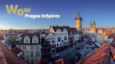
Prague’s new visual is based on a concept that conveys feelings and describes emotions and metaphorical encounters that a tourist in Prague experiences. Prague is magical, diverse and inspiring, but hides something indescribable within itself, so the logo itself becomes the communication content: it is clear, positive and understandable worldwide. In the same vein, the promotional slogan “Pure Emotion” underscores the entire visual style with its simplicity.
Pražská informační služba – Prague City Tourism, operator of the capital city’s official tourism portal, has moved to an easier-to-remember domain. The prague.eu portal runs in seven languages.The change of domain name also brings a change in the organization’s main visual to a modern, dynamic and yet unique symbol, which, in conjunction with a new marketing face for the tourism industry, will help shift the perception of Prague. The new logo depicts Prague as an intersection of cities, showing the four basic compass directions, and at the same time symbolizing the seasons and the four primary activities of the organization itself. The organization’s original name has been amended to include its English equivalent – “Pražská informační služba - Prague City Tourism” – which will help make its activities better understood both at home and abroad.